Lesson 07 - GLMs, Linear Optimization and Clustering
Lesson 07 - GLMs, Linear Optimization and Clustering
Welcome to lesson 8! We will continue on with our application of what we have learned so far to statistical analysis of our data.
Today we will cover Generalised Linear Models (in the form of logistic regression), Linear Optimization using NumPy, and clustering using UPGMA and Kmeans in scikit-learn.
Download the notebook here.
Generalised Linear Models
Linear models can be extended to fit certain non-linear data, using GLMs.
To do this, we need a ‘link’ function, which gives us a linear response. For today we will use a logistic regression, but we have a wide array of link functions available.
We use logistic regression where we have a binomial output - 0 or 1. For example whether a patient is sick (1) or not (0) relates to their temperature (continuous), but not in a linear fashion.
Let’s do some imports:
In [3]:
from pandas import Series, DataFrame
import pandas as pd
import statsmodels.api as sm
import statsmodels.formula.api as smf
import matplotlib.pyplot as plt
import numpy as np
import seaborn as sns
%matplotlib inline
We will read in some college admissions data. This data shows whether an applicant was admitted to a college or not, their gre and gpa, and a categorical ranking of the college by ‘prestige’.
We are interested in the relationship between admission, gpa, gre and prestige.
In [167]:
df = pd.read_csv("http://www.ats.ucla.edu/stat/data/binary.csv")
df.columns = ["admit", "gre", "gpa", "prestige"]
df.head()| admit | gre | gpa | prestige | |
|---|---|---|---|---|
| 0 | 0 | 380 | 3.61 | 3 |
| 1 | 1 | 660 | 3.67 | 3 |
| 2 | 1 | 800 | 4.00 | 1 |
| 3 | 1 | 640 | 3.19 | 4 |
| 4 | 0 | 520 | 2.93 | 4 |
Pandas has a crosstab function, which is useful for tabulating data based on categorical variables. Here we tabulate admit and prestige, before plotting out our data.
In [3]:
pd.crosstab(df['admit'], df['prestige'], rownames=['admit'])| prestige | 1 | 2 | 3 | 4 |
|---|---|---|---|---|
| admit | ||||
| 0 | 28 | 97 | 93 | 55 |
| 1 | 33 | 54 | 28 | 12 |
In [168]:
df.hist();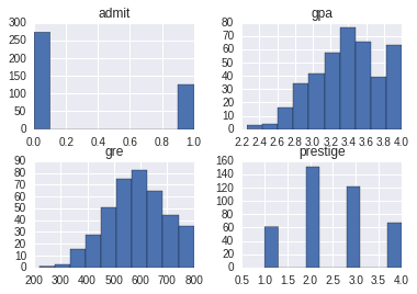
Now we can carry out our regression - we will model admission as a response of gre, prestige (as a categorical variable) and gpa.
To do this we can use the formula interface, similar to last week, and using the glm function with the family specified as Bionomial:
In [169]:
#using smf
logit = smf.glm('admit ~ gre + C(prestige) + gpa', family=sm.families.Binomial(), data = df)
print(logit.fit().summary())
Generalized Linear Model Regression Results
==============================================================================
Dep. Variable: admit No. Observations: 400
Model: GLM Df Residuals: 394
Model Family: Binomial Df Model: 5
Link Function: logit Scale: 1.0
Method: IRLS Log-Likelihood: -229.26
Date: Fri, 25 Mar 2016 Deviance: 458.52
Time: 09:57:37 Pearson chi2: 397.
No. Iterations: 6
====================================================================================
coef std err z P>|z| [95.0% Conf. Int.]
------------------------------------------------------------------------------------
Intercept -3.9900 1.140 -3.500 0.000 -6.224 -1.756
C(prestige)[T.2] -0.6754 0.316 -2.134 0.033 -1.296 -0.055
C(prestige)[T.3] -1.3402 0.345 -3.881 0.000 -2.017 -0.663
C(prestige)[T.4] -1.5515 0.418 -3.713 0.000 -2.370 -0.733
gre 0.0023 0.001 2.070 0.038 0.000 0.004
gpa 0.8040 0.332 2.423 0.015 0.154 1.454
====================================================================================
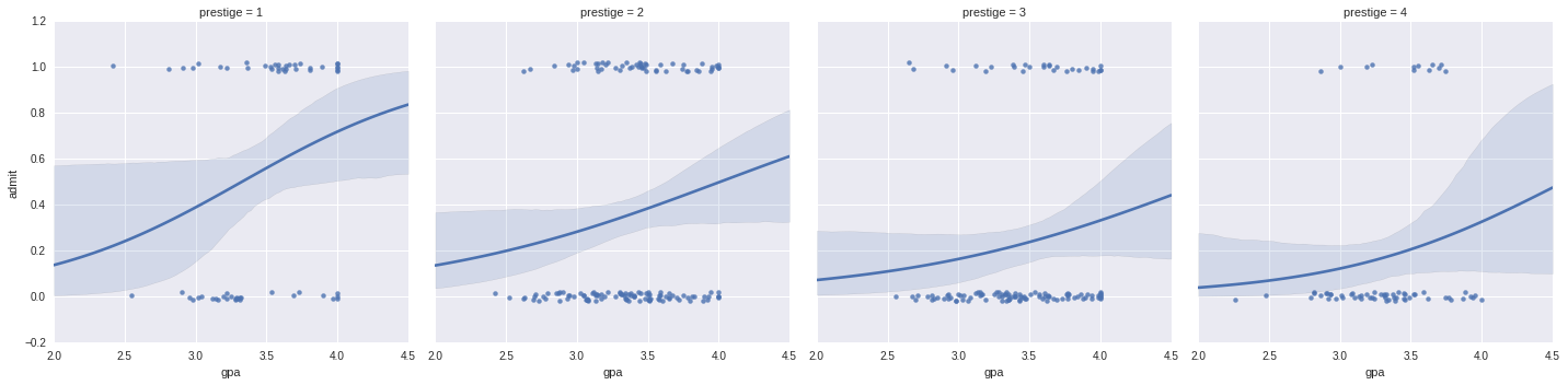
It is difficult to plot two continuous variables against each other: here we will use seaborn to plot the effects of gre and gpa seperately:
In [7]:
#plot
g = sns.lmplot(x="gre", y="admit", col="prestige", data=df, y_jitter=.02, logistic=True)
f = sns.lmplot(x="gpa", y="admit", col="prestige", data=df, y_jitter=.02, logistic=True)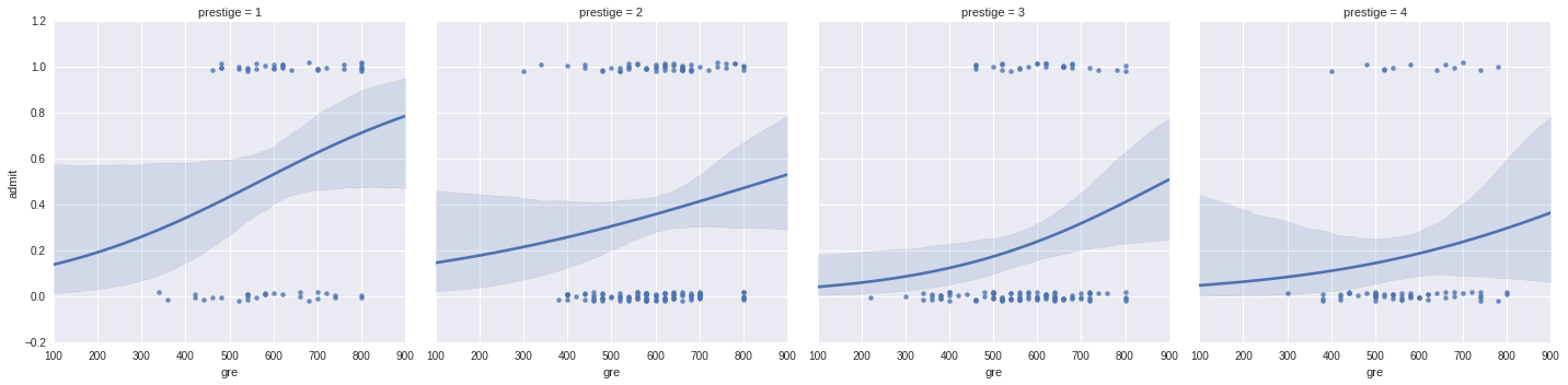
To use the non-formula interface, we need to create dumm variables. Dummy variables allow us to treat categorical variables as 1s and 0s by adding on more factors:
In [170]:
#we can also do it using the non-formula interface:
dummy_ranks = pd.get_dummies(df['prestige'], prefix='prestige')
dummy_ranks.head()| prestige_1 | prestige_2 | prestige_3 | prestige_4 | |
|---|---|---|---|---|
| 0 | 0.0 | 0.0 | 1.0 | 0.0 |
| 1 | 0.0 | 0.0 | 1.0 | 0.0 |
| 2 | 1.0 | 0.0 | 0.0 | 0.0 |
| 3 | 0.0 | 0.0 | 0.0 | 1.0 |
| 4 | 0.0 | 0.0 | 0.0 | 1.0 |
To avoid multi-colinearity, we must remove one of the dummy variables.
We also need to manually add an intercept column if we wish to allow for an intercept term in our model
In [9]:
#remove the first dummy variable
df2 = df[['admit', 'gre', 'gpa']].join(dummy_ranks.ix[:, 'prestige_2':])
#manually add an intercept:
df2['intercept'] = 1.0
df2.head()| admit | gre | gpa | prestige_2 | prestige_3 | prestige_4 | intercept | |
|---|---|---|---|---|---|---|---|
| 0 | 0 | 380 | 3.61 | 0.0 | 1.0 | 0.0 | 1.0 |
| 1 | 1 | 660 | 3.67 | 0.0 | 1.0 | 0.0 | 1.0 |
| 2 | 1 | 800 | 4.00 | 0.0 | 0.0 | 0.0 | 1.0 |
| 3 | 1 | 640 | 3.19 | 0.0 | 0.0 | 1.0 | 1.0 |
| 4 | 0 | 520 | 2.93 | 0.0 | 0.0 | 1.0 | 1.0 |
In [187]:
logit = sm.GLM(df2['admit'], df2[df2.columns[1:]], family=sm.families.Binomial())
print(logit.fit().summary())
Generalized Linear Model Regression Results
==============================================================================
Dep. Variable: admit No. Observations: 400
Model: GLM Df Residuals: 394
Model Family: Binomial Df Model: 5
Link Function: logit Scale: 1.0
Method: IRLS Log-Likelihood: -229.26
Date: Fri, 25 Mar 2016 Deviance: 458.52
Time: 10:16:29 Pearson chi2: 397.
No. Iterations: 6
==============================================================================
coef std err z P>|z| [95.0% Conf. Int.]
------------------------------------------------------------------------------
gre 0.0023 0.001 2.070 0.038 0.000 0.004
gpa 0.8040 0.332 2.423 0.015 0.154 1.454
prestige_2 -0.6754 0.316 -2.134 0.033 -1.296 -0.055
prestige_3 -1.3402 0.345 -3.881 0.000 -2.017 -0.663
prestige_4 -1.5515 0.418 -3.713 0.000 -2.370 -0.733
intercept -3.9900 1.140 -3.500 0.000 -6.224 -1.756
==============================================================================
We can see that the results are the same. The choice of formula or non formula interface is up to you - use whichever you feel most comfortable with.
We can get our odds ratios out by calling .params and taking the exp:
In [198]:
#odds ratios
np.exp(logit.fit().params)
gre 1.002267
gpa 2.234545
prestige_2 0.508931
prestige_3 0.261792
prestige_4 0.211938
intercept 0.018500
dtype: float64
Linear Optimization
Python has a variety of ways of carrying out linear optimization. We can either use the built in NumPy solver, or interface with a commercial or open source solver through Python.
Gurobi and AMPL both offer Python apis, as well as PuLP and pyomo which offer integration into a wide range of solvers. For use of these packages, see their help pages, as they have their own idiosyncracies.
The main purpose of these interfaces is to get the data in from our equations and then run the solvers - We will use the built in solver in scipy, available in the scipy.optimize library:
https://docs.scipy.org/doc/scipy/reference/generated/scipy.optimize.linprog.html
In [12]:
from scipy.optimize import linprogImagine we are working for French’s and we want to take advantage of the goodwill we have recently got from Canadian consumers.
We want to maxmise our profit on mustard and ketchup: We have 650 units of Canadian tomatoes, 1800 units of vinegar and 600 units of mustard seed available. We need 2 units of tomatoes and 4 of vinegar per pallet of ketchup, and 3 units of mustard seed and 7 units of vinegar per palette of mustard.
We can sell ketchup at $400 per palette, and mustard at $300 per palette.
We also have a limit on our new Canadian ketchup factory - we can produce at most 400 palettes of both products.
We also have to produce at lease 100 units of each product to protect our brand.
First let’s state our constraints mathematically:
maximize:
- profit = 400 * ketchup + 300 * mustard
subject to:
-
ketchup * 2 <= 650
-
ketchup * 4 + mustard * 7 <= 1800
-
mustard * 3 <= 600
-
ketchup + mustard <= 400
-
ketchup >= 100
-
mustard >= 100
Let’s plot out our system using our knowledge of matplotlib from last lesson:
In [201]:
fig, ax = plt.subplots(figsize=(8, 8))
k = np.linspace(0, 1000)
m = np.linspace(0, 1000)
#vinegar supply
plt.plot(k, (1800 - k*4)/7, lw=3, label='vinegar')
#tomato supply
plt.plot(375 * np.ones_like(k), k, lw=3, label='tomato supply')
#mustard supply
plt.plot(m, 200 * np.ones_like(m), lw=3, label='mustard supply')
#factory limit
plt.plot((350 - k), k, lw=3, label='factory capacity')
#minimum mustard
plt.plot(m, 100 * np.ones_like(m), lw=3, label='mustard minimum')
#minimum ketchup
plt.plot(100 * np.ones_like(k), k, lw=3, label='ketchup minimum')
#set axis limits
ax.set(xlim=[0, 550], ylim = [0,350], ylabel = 'mustard', xlabel = 'ketchup')
#legend
plt.legend();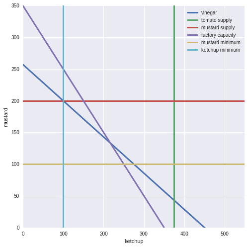
Now we need to specify our system to solve it.
To do this, we give an array, c, to be minimized, a 2D array (A) which gives the coefficients to be satisfied, and a 1D array with the upper bounds.
We can also optionally use equalities rather than upper bounds.
In [202]:
#optimize minimizes, so we take the negative of our values
c = [-400, -300]
#our input formula
A = [[2,0], [4,7], [0,3], [1,1], [-1,0], [0,-1]]
#our values
b = [650, 1800, 600, 350, -100, -100]
#bounds as a tuple
k_bounds = (0, 400)
#secondary bounds
m_bounds = (0, 400)
#linprog:
res = linprog(c, A_ub=A, b_ub=b, bounds=(k_bounds, m_bounds), options={"disp": True})
Optimization terminated successfully.
Current function value: -130000.000000
Iterations: 3
In [203]:
res fun: -130000.0
message: 'Optimization terminated successfully.'
nit: 3
slack: array([ 150., 100., 300., 0., 150., 300., 0., 0.])
status: 0
success: True
x: array([ 250., 100.])
In [165]:
250 * 400 + 100 * 300130000
We can generalize this to multiple dimensions and variables! In scipy, we only have a simplex solver available, so to find faster and other solvers, try playing with pyomo and pulp. In general, these packages produce the same arrays to pass into the solvers from nicer inputs - the solvers and algorithms are the differences here.
Clustering
Clustering allows us to put multidimensional data into bins by similarity.
Clustering is one of the major methods used, and be both supervised or unsupervised - where we know a priori the ;number of clusters or not.
Today we will use two supervised clustering examples, before we move on to more sophisticated methods of clustering in the next lessons.
First, let’s load in some libraries and data:
In [1]:
from sklearn import datasets
from scipy.cluster.hierarchy import dendrogram, linkage, fcluster

iris = datasets.load_iris()

dat = iris.data
target = iris.target
print(iris.DESCR)
Iris Plants Database
Notes
-----
Data Set Characteristics:
:Number of Instances: 150 (50 in each of three classes)
:Number of Attributes: 4 numeric, predictive attributes and the class
:Attribute Information:
- sepal length in cm
- sepal width in cm
- petal length in cm
- petal width in cm
- class:
- Iris-Setosa
- Iris-Versicolour
- Iris-Virginica
:Summary Statistics:
============== ==== ==== ======= ===== ====================
Min Max Mean SD Class Correlation
============== ==== ==== ======= ===== ====================
sepal length: 4.3 7.9 5.84 0.83 0.7826
sepal width: 2.0 4.4 3.05 0.43 -0.4194
petal length: 1.0 6.9 3.76 1.76 0.9490 (high!)
petal width: 0.1 2.5 1.20 0.76 0.9565 (high!)
============== ==== ==== ======= ===== ====================
:Missing Attribute Values: None
:Class Distribution: 33.3% for each of 3 classes.
:Creator: R.A. Fisher
:Donor: Michael Marshall (MARSHALL%PLU@io.arc.nasa.gov)
:Date: July, 1988
This is a copy of UCI ML iris datasets.
http://archive.ics.uci.edu/ml/datasets/Iris
The famous Iris database, first used by Sir R.A Fisher
This is perhaps the best known database to be found in the
pattern recognition literature. Fisher's paper is a classic in the field and
is referenced frequently to this day. (See Duda & Hart, for example.) The
data set contains 3 classes of 50 instances each, where each class refers to a
type of iris plant. One class is linearly separable from the other 2; the
latter are NOT linearly separable from each other.
References
----------
- Fisher,R.A. "The use of multiple measurements in taxonomic problems"
Annual Eugenics, 7, Part II, 179-188 (1936); also in "Contributions to
Mathematical Statistics" (John Wiley, NY, 1950).
- Duda,R.O., & Hart,P.E. (1973) Pattern Classification and Scene Analysis.
(Q327.D83) John Wiley & Sons. ISBN 0-471-22361-1. See page 218.
- Dasarathy, B.V. (1980) "Nosing Around the Neighborhood: A New System
Structure and Classification Rule for Recognition in Partially Exposed
Environments". IEEE Transactions on Pattern Analysis and Machine
Intelligence, Vol. PAMI-2, No. 1, 67-71.
- Gates, G.W. (1972) "The Reduced Nearest Neighbor Rule". IEEE Transactions
on Information Theory, May 1972, 431-433.
- See also: 1988 MLC Proceedings, 54-64. Cheeseman et al"s AUTOCLASS II
conceptual clustering system finds 3 classes in the data.
- Many, many more ...
Now let’s plot the first two dimensions:
In [4]:
plt.scatter(dat[:, 0], dat[:, 1], c = target);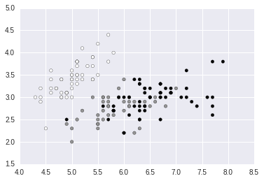
Now we can plot these using seaborn. We will use the same dataset, but in a slightly different format:
In [5]:
iris = sns.load_dataset("iris")
print(iris.head())
sns.clustermap(iris[['sepal_length',  'sepal_width',  'petal_length',  'petal_width']], col_cluster=False)
sepal_length sepal_width petal_length petal_width species
0 5.1 3.5 1.4 0.2 setosa
1 4.9 3.0 1.4 0.2 setosa
2 4.7 3.2 1.3 0.2 setosa
3 4.6 3.1 1.5 0.2 setosa
4 5.0 3.6 1.4 0.2 setosa
<seaborn.matrix.ClusterGrid at 0x7fe70cbd2ba8>
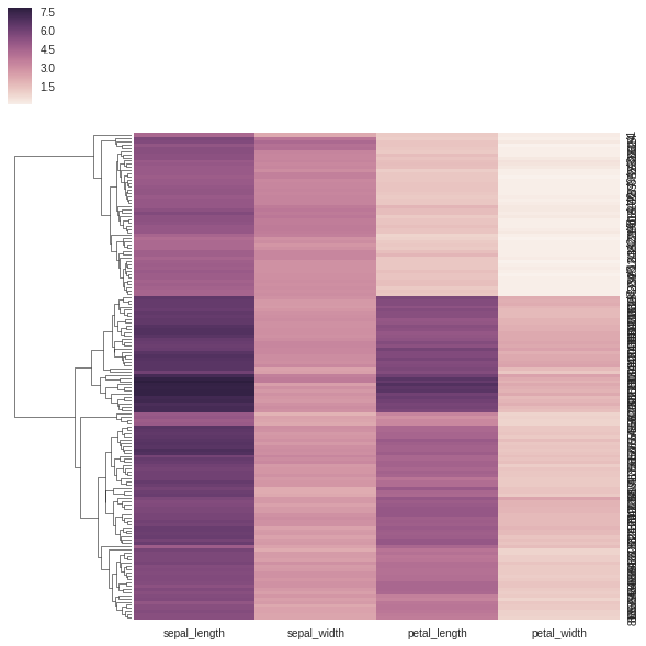
However, we quickly run into the same problem as last lesson - how do we get the values out?
Under the hood, seaborn is using scipy.cluster.hierarchy
To recapitulate the results, we can use the function linkage:
In [6]:
linkagemat = linkage(dat, 'average')
linkagemat.shape
(149, 4)
Here I am using straight pairwise differences, we can use a wide range of distance metrics. You should also correct your data for outliers and different scales - here we have data all in a similar scale, so the differences are simple to use as is.
The method for clustering used is ‘average’, also known as the UPGMA method, common in ecology (and many other fields).
This works by finding the two most similar items, clustering them and meaning their values. The branch length is then the distance between these objects. The method works recursively until there is only one group left. We have a wide range of methods to use here.
Now we can plot using dendrogram:
In [7]:
plt.figure(figsize=(25, 10))
dendrogram(
    linkagemat,
    leaf_rotation=90.,  # rotates the x axis labels
    leaf_font_size=8.  # font size for the x axis labels
);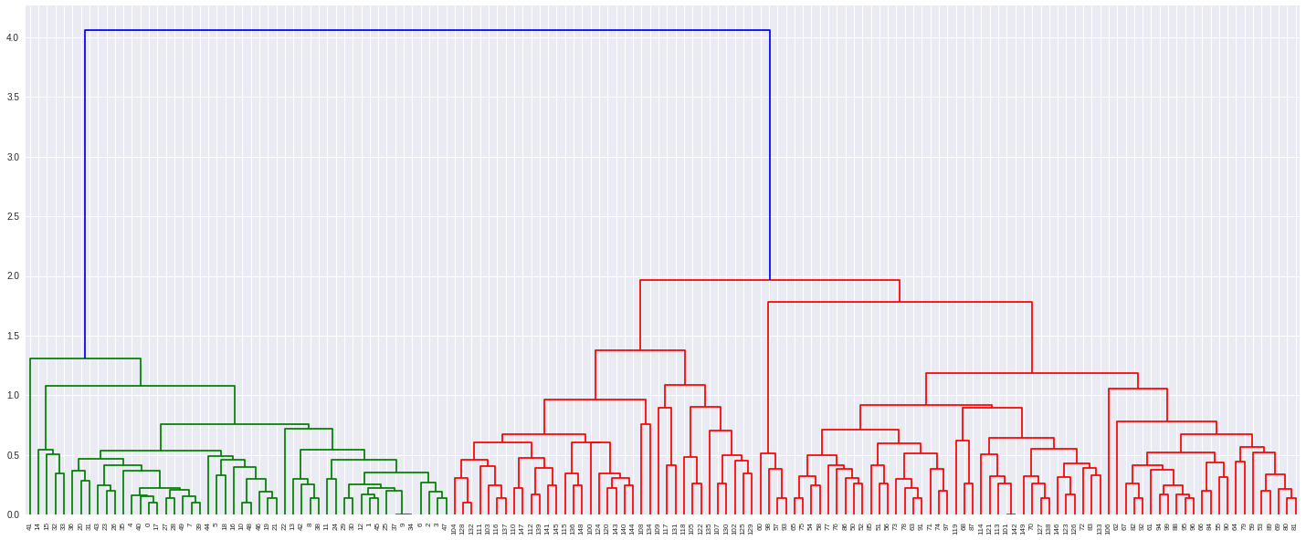
From here we can cluster using a variety of methods, with the function fclust.
We can specify a number of clusters, which works by descending a line until we hit the given distance or specifying a distance. Let’s specify three clusters:
In [8]:
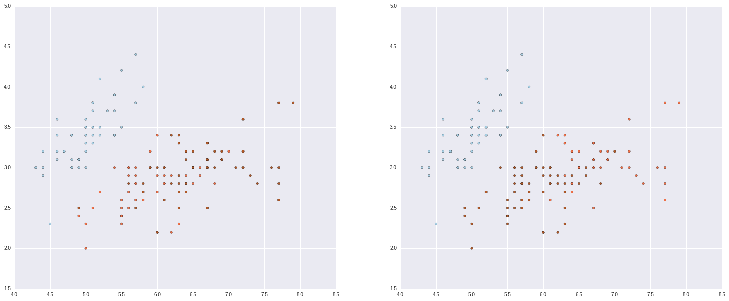
out = fcluster(linkagemat, 3, criterion='maxclust')
#and plot
fig = plt.figure(figsize=(25, 10))
ax1 = fig.add_subplot(1,2,1)
ax2 = fig.add_subplot(1,2,2)
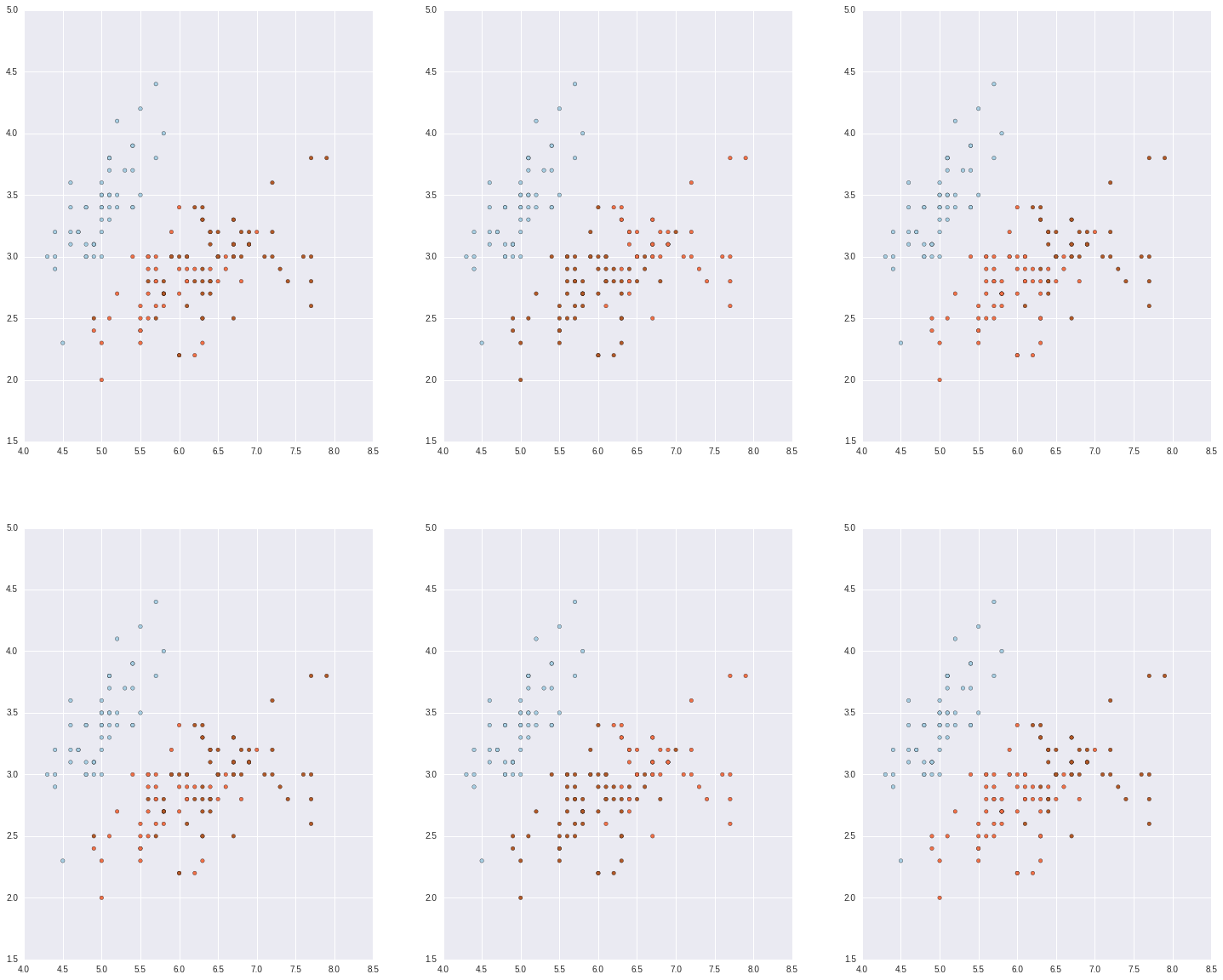
ax1.scatter(dat[:, 0], dat[:, 1], c = target, cmap=plt.cm.Paired)
ax2.scatter(dat[:, 0], dat[:, 1], c = out, cmap=plt.cm.Paired)<matplotlib.collections.PathCollection at 0x7fe70c44ec50>
We can also use kmeans, another clustering algorithm. This works by putting k random centroids on a graph, finding the closest centroid to each point, then moving centroids to minimize the error within each group.
Let’s do this in scikit-learn, the machine learning library.
We will cover sci kit learn exclusively in the next lesson, but for now we can do a brief overview.
We have already imported the dataset, iris from it. Datasets are generally used or made into numpy matrices, with data and targets as seperate arrays. The data are stored as np.float64 by default, and we need to convert categorical variables into dummy variables, but targets are ok as categorical variables.
There is a wide range of clustering algorithms available. For now we will run a simple kmeans.
Scikit-learn is set up to allow validation, pipelining etc etc.
In [9]:
from sklearn.cluster import KMeans

#describe the model note, no data yet
k_means = KMeans(n_clusters=3)
k_means.fit(dat)
k_means.labels_
array([0, 0, 0, 0, 0, 0, 0, 0, 0, 0, 0, 0, 0, 0, 0, 0, 0, 0, 0, 0, 0, 0, 0,
0, 0, 0, 0, 0, 0, 0, 0, 0, 0, 0, 0, 0, 0, 0, 0, 0, 0, 0, 0, 0, 0, 0,
0, 0, 0, 0, 1, 1, 2, 1, 1, 1, 1, 1, 1, 1, 1, 1, 1, 1, 1, 1, 1, 1, 1,
1, 1, 1, 1, 1, 1, 1, 1, 2, 1, 1, 1, 1, 1, 1, 1, 1, 1, 1, 1, 1, 1, 1,
1, 1, 1, 1, 1, 1, 1, 1, 2, 1, 2, 2, 2, 2, 1, 2, 2, 2, 2, 2, 2, 1, 1,
2, 2, 2, 2, 1, 2, 1, 2, 1, 2, 2, 1, 1, 2, 2, 2, 2, 2, 1, 2, 2, 2, 2,
1, 2, 2, 2, 1, 2, 2, 2, 1, 2, 2, 1], dtype=int32)
In [10]:
from sklearn import decomposition
#PCA
pca = decomposition.PCA(n_components=3)
pca.fit(dat)
X = pca.transform(dat)

#rerun kmeans
k_meanspca = KMeans(n_clusters=3)
k_meanspca.fit(X)

#rerurn UPGMA
linkagematpca = linkage(X, 'average')
outpca = fcluster(linkagemat, 3, criterion='maxclust')

#plot
fig = plt.figure(figsize=(25, 20))
ax1 = fig.add_subplot(2,3,1)
ax2 = fig.add_subplot(2,3,2)
ax3 = fig.add_subplot(2,3,3)
ax4 = fig.add_subplot(2,3,4)
ax5 = fig.add_subplot(2,3,5)
ax6 = fig.add_subplot(2,3,6)
ax1.scatter(dat[:, 0], dat[:, 1], c = target, cmap=plt.cm.Paired)
ax2.scatter(dat[:, 0], dat[:, 1], c = out, cmap=plt.cm.Paired)
ax3.scatter(dat[:, 0], dat[:, 1], c = k_means.labels_, cmap=plt.cm.Paired)
ax4.scatter(dat[:, 0], dat[:, 1], c = target, cmap=plt.cm.Paired)
ax5.scatter(dat[:, 0], dat[:, 1], c = outpca, cmap=plt.cm.Paired)
ax6.scatter(dat[:, 0], dat[:, 1], c = k_meanspca.labels_, cmap=plt.cm.Paired)
<matplotlib.collections.PathCollection at 0x7fe70be615f8>
That’s it for today, we have had a brief tour of GLMs, linear optimisation and clustering. Next week we will focus on scikit-learn and some applied pipelines and examples.
Exercises
All these exercises are a little tough this week, do numbers 3 and 4, and do the questions from 1,2,5 and 6 which are relevant to your work.
1. Use the awards data from ucla to carry out a poisson glm in stasmodels:
awarddata = pd.read_csv("http://www.ats.ucla.edu/stat/data/poisson_sim.csv")The data shows how many awards a student received, with columns for their math score, and the program they were in coded as a categorical variable.
2. Solve the optimization problem (taken from http://www.purplemath.com/modules/linprog3.htm)
P = –2x + 5y, subject to:
100 < x < 200
80 < y < 170
y > –x + 200
3. Change the iris data set from seaborn into the numpy format used by scikit-learn.
4. Change the iris data set from scikit-learn into a pandas dataframe the same as used in seaborn
5. Make some ‘noisy moons’ using scikit-learns dataset module:
noisy_moons = datasets.make_moons(n_samples=500, noise=.05)
#plot using
plt.scatter(noisy_moons[0][:,0], noisy_moons[0][:,1], c = noisy_moons[1])
Fit the data using a Kmeans algorithm.
6. Fit your noisy moons data using hierarchical clustering