Lesson 06 - Plotting and regression
Lesson 06 - Plotting and regression
Welcome to lesson 7. Today we will learn the basics of plotting in python, and how to carry out a linear regression.
Python does not come with built in plotting capability - if you are using it to make a website, you probably don’t want the ability to draw a histogram.
Again, the Python community has picked up and run with a number of different ways of plotting data, and today we will focus on the most commonly used package, matplotlib, and its extension, seaborn.
Almost all plotting packages are based on matplotlib under the hood, so we will spend some time there, before moving on to the native pandas plotting methods, and seaborn.
For those who know R, there is an effort to port ggplot2 into python - available on yhats github or website. It is semi-abandoned, so we won’t dicuss it any more, but it is a low overhead way to get current R plots working in Python.
matplotlib
matplotlib started life as a clone of the graphing capabilities from matlab into python, by John Hunter.
Let’s run our imports:
In [1]:
from pandas import Series, DataFrame
import pandas as pd
import matplotlib.pyplot as plt
import numpy as np
/home/jeremy/anaconda3/lib/python3.5/site-packages/pandas/computation/__init__.py:19: UserWarning: The installed version of numexpr 2.4.4 is not supported in pandas and will be not be used
UserWarning)
To work with matplotlib, we generally initiate a figure, add layers to it and then save (or display). We will cover how to do this towards the end of the lesson, for now we will display in the notebook.
Let’s make and plot an example:
In [2]:
x = DataFrame({'x':np.arange(20), 'y':np.flipud(np.arange(20)), 'z':np.random.randn(20)})
z = plt.plot(x['x'], x['y'])
Huh, we did not get a graph, just a matplotlib object. To fix this, we need the magic command, %matplotlib inline:
In [3]:
%matplotlib inline
x = DataFrame({'x':np.arange(20), 'y':np.flipud(np.arange(20)), 'z':np.random.randn(20)})
z = plt.plot(x['x'], x['y'])
#by assigning we have supressed the matplotlib object printing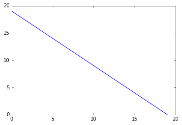
matplotlib works by making a figure object, and adding to it. Let’s make a 2*2 subplot and add in some plot types
In [4]:
figure = plt.figure()
ax1 = figure.add_subplot(2, 2, 1)
ax2 = figure.add_subplot(2, 2, 2)
ax3 = figure.add_subplot(2, 2, 3)
ax4 = figure.add_subplot(2, 2, 4)
In [5]:
ax1.hist(x['z'])
ax2.plot(x['x'], x['y'], '--')
ax3.scatter(x['x'], x['y'])
ax4.bar(x['x'], x['y'])
figure
Anatomy of a plot
Matplotlib stores plots as a figure object, which contains subplots (or axes), which contain titles, x and y values and the actual plot. We can add on multiple plot types on one axis. We can add them on one by one:
In [6]:
fig = plt.figure();
ax = fig.add_subplot(111);
ax.plot([1, 2, 3, 4], [10, 20, 25, 30], color='lightblue', linewidth=3);
ax.scatter([0.3, 3.8, 1.2, 2.5], [11, 25, 9, 26], color='darkgreen', marker='^');
ax.set(xlim = [0.5, 4.5], title = 'title!', ylabel = 'y', xlabel = 'x');
#here we would use plt.savefig('figpath.png', dpi=400)
[<matplotlib.text.Text at 0x7f9c1abd8160>,
(0.5, 4.5),
<matplotlib.text.Text at 0x7f9c1ac42128>,
<matplotlib.text.Text at 0x7f9c1abe9fd0>]
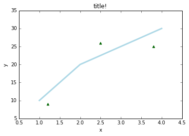
We can use multiple colours, markers and line types.
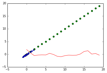
For mutliple lines, we can use recurring triples of arguments:
In [7]:
plt.plot(x['y'], x['z'], 'r-', x['x'], x['x'], 'go', x['z'], x['z'], 'b^')[<matplotlib.lines.Line2D at 0x7f9c1ab02e80>,
<matplotlib.lines.Line2D at 0x7f9c1ab08048>,
<matplotlib.lines.Line2D at 0x7f9c1ab089e8>]
This works for wide data, how about long data?
In [8]:
dat = DataFrame({'x':np.random.randn(20),'y':[1,2]*10, 'z':[val for val in range(10) for _ in (0, 1)]})
dat| x | y | z | |
|---|---|---|---|
| 0 | 1.102013 | 1 | 0 |
| 1 | -0.637193 | 2 | 0 |
| 2 | 0.912517 | 1 | 1 |
| 3 | -0.545682 | 2 | 1 |
| 4 | -0.429343 | 1 | 2 |
| 5 | 0.068764 | 2 | 2 |
| 6 | -0.701236 | 1 | 3 |
| 7 | -0.161256 | 2 | 3 |
| 8 | 0.363720 | 1 | 4 |
| 9 | 0.031702 | 2 | 4 |
| 10 | 0.260826 | 1 | 5 |
| 11 | 0.663435 | 2 | 5 |
| 12 | 0.946932 | 1 | 6 |
| 13 | 1.547725 | 2 | 6 |
| 14 | 0.924813 | 1 | 7 |
| 15 | -0.691675 | 2 | 7 |
| 16 | 0.191418 | 1 | 8 |
| 17 | -0.567183 | 2 | 8 |
| 18 | 0.030932 | 1 | 9 |
| 19 | 0.889163 | 2 | 9 |
In [9]:
colors = ['green', 'blue']
for i in range(len(np.unique(dat['y']))):
    plt.plot(dat['z'][dat['y']==np.unique(dat['y'])[i]],
             dat['x'][dat['y']==np.unique(dat['y'])[i]], color = colors[i])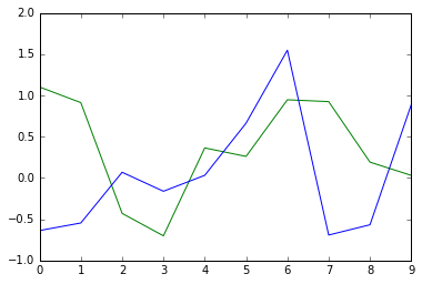
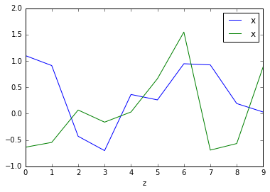
Luckily, we have pandas and groupby:
In [10]:
fig, ax = plt.subplots(1,1); dat.groupby("y").plot(x="z", y="x", ax=ax)y
1 Axes(0.125,0.125;0.775x0.775)
2 Axes(0.125,0.125;0.775x0.775)
dtype: object
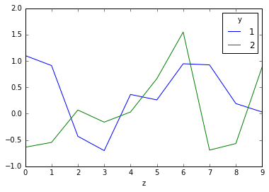
or we could pivot using pivot tables, so that each level gets its own column:
In [11]:
pivoted = pd.pivot_table(dat, values='x', columns='y', index = 'z')
pivoted.plot()
<matplotlib.axes._subplots.AxesSubplot at 0x7f9c1abe9390>
We can also use boxplots:
In [12]:
x = DataFrame({'x':np.random.randn(20)})
plt.boxplot(x['x']);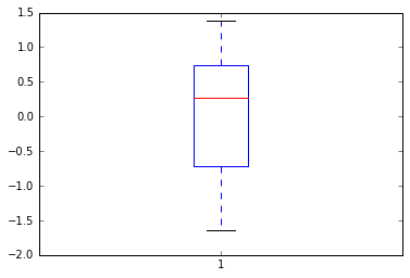
but it doesn’t look too nice….
Seaborn
Seaborn is an extension to matplotlib, which adds a more modern looking theme, better colour palettes as well as built in plots for several common statistical methods
Let’s redo our boxplot
In [13]:
import seaborn as sns
fig = plt.figure()
ax1 = fig.add_subplot(1,2,1)
ax1.boxplot(x['x'])
ax2 = fig.add_subplot(1,2,2)
ax2 = sns.boxplot(x['x'], orient = 'v')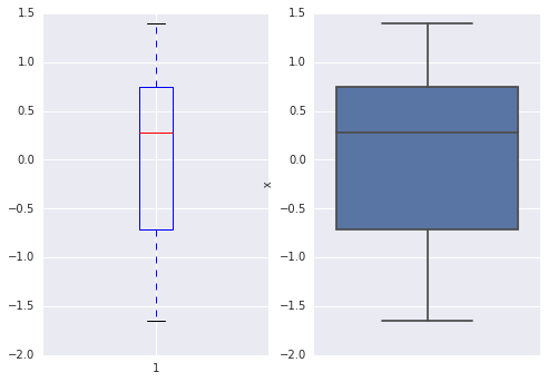
We can see a couple of things - the seaborn plot looks nicer, and the boxplot has a grid and different axes!
Importing seaborn by default changes the parameters in matplotlib, so beware.
Let’s load some new data and try out a violin plot:
In [14]:
tips = sns.load_dataset("tips")

print(tips.head())

sns.violinplot(x = 'sex', y = 'tip', data = tips);
total_bill tip sex smoker day time size
0 16.99 1.01 Female No Sun Dinner 2
1 10.34 1.66 Male No Sun Dinner 3
2 21.01 3.50 Male No Sun Dinner 3
3 23.68 3.31 Male No Sun Dinner 2
4 24.59 3.61 Female No Sun Dinner 4
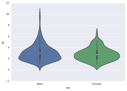
For more info on seaborn and its plots and arguments, see the online help.
Plotting is an example where it is best to learn as you go - use google, stackoverflow and the docs to figure out what you want to do!
E.g. How do I move the above axis label up to the origin?
Linear Regression
Seaborn has a nice set of built in plots to carry out linear regression. Let’s use the tips data to continue on:
In [15]:
sns.regplot("total_bill", "tip", tips);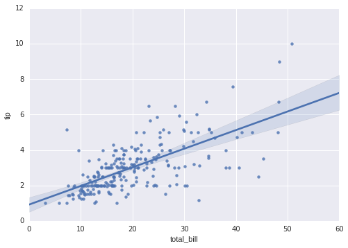
In [16]:
sns.residplot("total_bill", "tip", tips);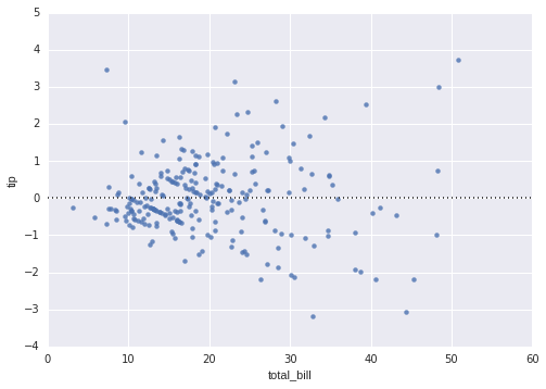
In [17]:
sns.lmplot("total_bill", "tip", hue = 'sex', data = tips);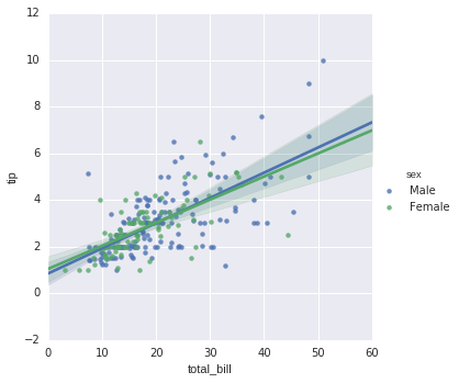
In [18]:
sns.lmplot("total_bill", "tip", hue = 'sex', col = 'smoker', data = tips);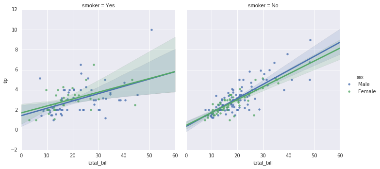
In [19]:
sns.lmplot("total_bill", "tip", tips, lowess=True, line_kws={"color": 'black'});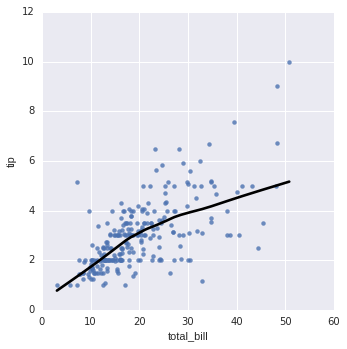
Great! but how do we get the parameters? Turns out, we can’t from seaborn…….
Linear Regression
Again, there is no built in linear model method in Python. There are several competing methods - we will cover a couple today, and then dive into scikit- learn in a later lesson.
In [20]:
#using scipy.stats:
from scipy import stats
x = DataFrame({'x':np.random.randn(20), 'y':np.random.randn(20)})
slope, intercept, r_value, p_value, std_err = stats.linregress(x['x'],x['y'])
print(slope, intercept, r_value, p_value, std_err)
#using numpy polyfit:
slope, intercept = np.polyfit(x['x'], x['y'], 1)
print(slope, intercept)
-0.615438731278 -0.514612376288 -0.515220481006 0.0200802461623 0.241304544215
-0.615438731278 -0.514612376288
Not so great - we might want a built in plotter, or more data about the actual regression. We might also want to use glms later down the road.
statsmodels is a package made by Wes McKinney originally, and continues to be maintained. It has methods for linear regression, as well as glms, mixed effect models and lots of other useful statistics. See the statsmodels website for more information.
For detailed examples of linear regression, see the regression help pages
In [24]:
import statsmodels.formula.api as smf
import statsmodels.api as sm
#we can use R style formulas:
results = smf.ols('y ~ x', data=x).fit()
In [25]:
print(results.summary()) OLS Regression Results
==============================================================================
Dep. Variable: y R-squared: 0.265
Model: OLS Adj. R-squared: 0.225
Method: Least Squares F-statistic: 6.505
Date: Mon, 21 Mar 2016 Prob (F-statistic): 0.0201
Time: 08:15:21 Log-Likelihood: -29.364
No. Observations: 20 AIC: 62.73
Df Residuals: 18 BIC: 64.72
Df Model: 1
Covariance Type: nonrobust
==============================================================================
coef std err t P>|t| [95.0% Conf. Int.]
------------------------------------------------------------------------------
Intercept -0.5146 0.249 -2.069 0.053 -1.037 0.008
x -0.6154 0.241 -2.550 0.020 -1.122 -0.108
==============================================================================
Omnibus: 0.495 Durbin-Watson: 2.297
Prob(Omnibus): 0.781 Jarque-Bera (JB): 0.594
Skew: -0.277 Prob(JB): 0.743
Kurtosis: 2.363 Cond. No. 1.10
==============================================================================
Warnings:
[1] Standard Errors assume that the covariance matrix of the errors is correctly specified.
We can also use multiple and categorical variables:
In [26]:
df = sm.datasets.get_rdataset("Guerry", "HistData").data
df = df[['Lottery', 'Literacy', 'Wealth', 'Region']].dropna()
df.head()| Lottery | Literacy | Wealth | Region | |
|---|---|---|---|---|
| 0 | 41 | 37 | 73 | E |
| 1 | 38 | 51 | 22 | N |
| 2 | 66 | 13 | 61 | C |
| 3 | 80 | 46 | 76 | E |
| 4 | 79 | 69 | 83 | E |
In [27]:
#+ adds more variables
#the output shows an intercept for categorical variables
mod = smf.ols(formula='Lottery ~ Literacy + Wealth + Region', data=df)
res = mod.fit()
print(res.summary())
OLS Regression Results
==============================================================================
Dep. Variable: Lottery R-squared: 0.338
Model: OLS Adj. R-squared: 0.287
Method: Least Squares F-statistic: 6.636
Date: Mon, 21 Mar 2016 Prob (F-statistic): 1.07e-05
Time: 08:15:28 Log-Likelihood: -375.30
No. Observations: 85 AIC: 764.6
Df Residuals: 78 BIC: 781.7
Df Model: 6
Covariance Type: nonrobust
===============================================================================
coef std err t P>|t| [95.0% Conf. Int.]
-------------------------------------------------------------------------------
Intercept 38.6517 9.456 4.087 0.000 19.826 57.478
Region[T.E] -15.4278 9.727 -1.586 0.117 -34.793 3.938
Region[T.N] -10.0170 9.260 -1.082 0.283 -28.453 8.419
Region[T.S] -4.5483 7.279 -0.625 0.534 -19.039 9.943
Region[T.W] -10.0913 7.196 -1.402 0.165 -24.418 4.235
Literacy -0.1858 0.210 -0.886 0.378 -0.603 0.232
Wealth 0.4515 0.103 4.390 0.000 0.247 0.656
==============================================================================
Omnibus: 3.049 Durbin-Watson: 1.785
Prob(Omnibus): 0.218 Jarque-Bera (JB): 2.694
Skew: -0.340 Prob(JB): 0.260
Kurtosis: 2.454 Cond. No. 371.
==============================================================================
Warnings:
[1] Standard Errors assume that the covariance matrix of the errors is correctly specified.
In [28]:
#using -1 we can remove an intercept
#using a star we give the interaction and individual terms used
res2 = smf.ols(formula='Lottery ~ Literacy * Wealth - 1', data=df).fit()
print(res2.params)
Literacy 0.427386
Wealth 1.080987
Literacy:Wealth -0.013609
dtype: float64
We can also use the machine learning library, scikit-learn. Scikit learn will be covered in more detail in a later class, but for now we can see that it has a wide range of regression models built in. The standard criticism of scikit learn is that it has a million different ways of doing an analysis and very little guidance as to which version to use, and why.
Two way ANOVA example
In [75]:
moore = sm.datasets.get_rdataset("Moore", "car", cache=True).data
moore = moore.rename(columns={"partner.status" : "partner_status"})
moore.head()| partner_status | conformity | fcategory | fscore | |
|---|---|---|---|---|
| 0 | low | 8 | low | 37 |
| 1 | low | 4 | high | 57 |
| 2 | low | 8 | high | 65 |
| 3 | low | 7 | low | 20 |
| 4 | low | 10 | low | 36 |
In [77]:
moore_lm = smf.ols('conformity ~ C(fcategory, Sum)*C(partner_status, Sum)',data=moore).fit()
print(sm.stats.anova_lm(moore_lm, typ=2))
sum_sq df F \
C(fcategory, Sum) 11.614700 2.0 0.276958
C(partner_status, Sum) 212.213778 1.0 10.120692
C(fcategory, Sum):C(partner_status, Sum) 175.488928 2.0 4.184623
Residual 817.763961 39.0 NaN
PR(>F)
C(fcategory, Sum) 0.759564
C(partner_status, Sum) 0.002874
C(fcategory, Sum):C(partner_status, Sum) 0.022572
Residual NaN
Summary
That’s it for today. We have covered matplotlib and seaborn plotting, as well as a number of methods of carrying out a linear regression.
Next week we will cover generalized linear models, linear optimization and clustering.
Exercises
- for the Following data:
dat = DataFrame({'x':np.random.randn(20),'y':[1,2]*10, 'z':[val for val in range(10) for _ in (0, 1)]})modify the below plot to have a sensible legend (you will need to use the docs and google)
fig, ax = plt.subplots(1,1); dat.groupby("y").plot(x="z", y="x", ax=ax)- For the violin plot:
tips = sns.load_dataset("tips")
sns.violinplot(x = 'sex', y = 'tip', data = tips);
Modify it to have the x axis at y = 0
- Using the mtcars dataset:
mpg = pd.read_csv('https://vincentarelbundock.github.io/Rdatasets/csv/ggplot2/mpg.csv')Carry out a linear regression between cyl (cylinders) and hwy (highway mpg). What are the relevant stats?
- Using sns.factorplot, plot the anova we carried out in class:
moore = sm.datasets.get_rdataset("Moore", "car", cache=True).data
moore = moore.rename(columns={"partner.status" : "partner_status"})